SEA for EFFECTIVE INTERNAL & EXTERNAL COMMUNICATIONS Working with teams for over 30 years
The Journey
The process often resembles the different stages of a journey and this exciting project started by asking a sample group to contribute words to establish the character and philosophy of the organisation beyond the practical delivery of support and services.
It was clearly important that the new logo would seek to communicate many of the values alongside the more familiar commercial qualities that its diverse audiences would expect.
Further filtering and prioritising took place to identify messaging that may be fresher to the market and identify ‘difference’ in future communications.
The selected words covering this first part of the journey were:
Connected – Passionate – Curious
Other key aspects of the process were as follows:
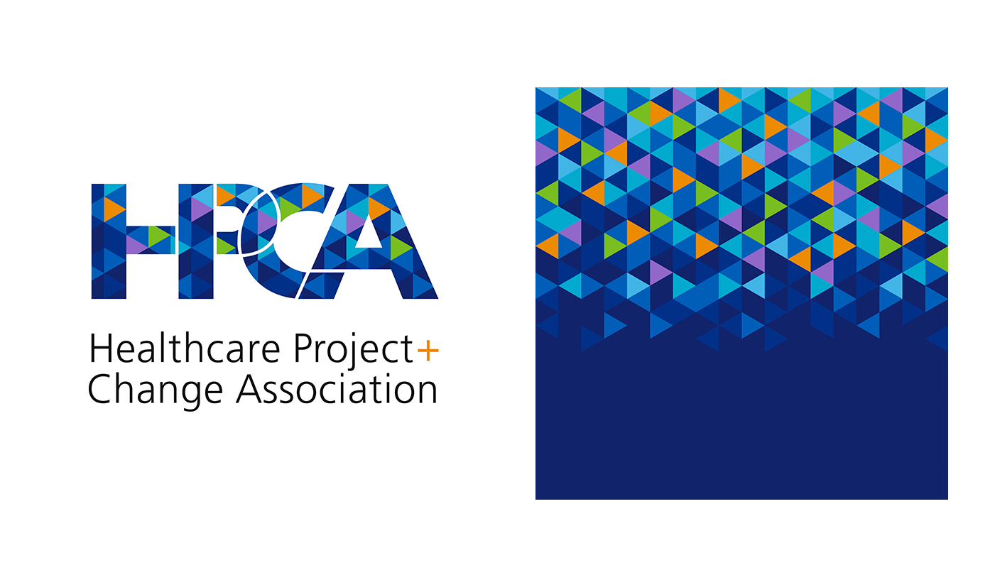
Regarding colours it was felt that it was important to convey HERITAGE & EVOLUTION
The Brand Workshop identified a strength in acknowledging the significance of the NHS corporate colours in HPCA’s evolution.
Re the extended colour palette, it was agreed that the HPCA’s principal palette would feature the five ‘corporate’ blues and three accent colours to animate.
It was felt that the typography would be based on the sense of HERITAGE & EVOLUTION. The Brand Workshop also identified the positive visual messaging and practicality of retaining the clear and familiar NHS Project Futures font family in HPCA’s communications.
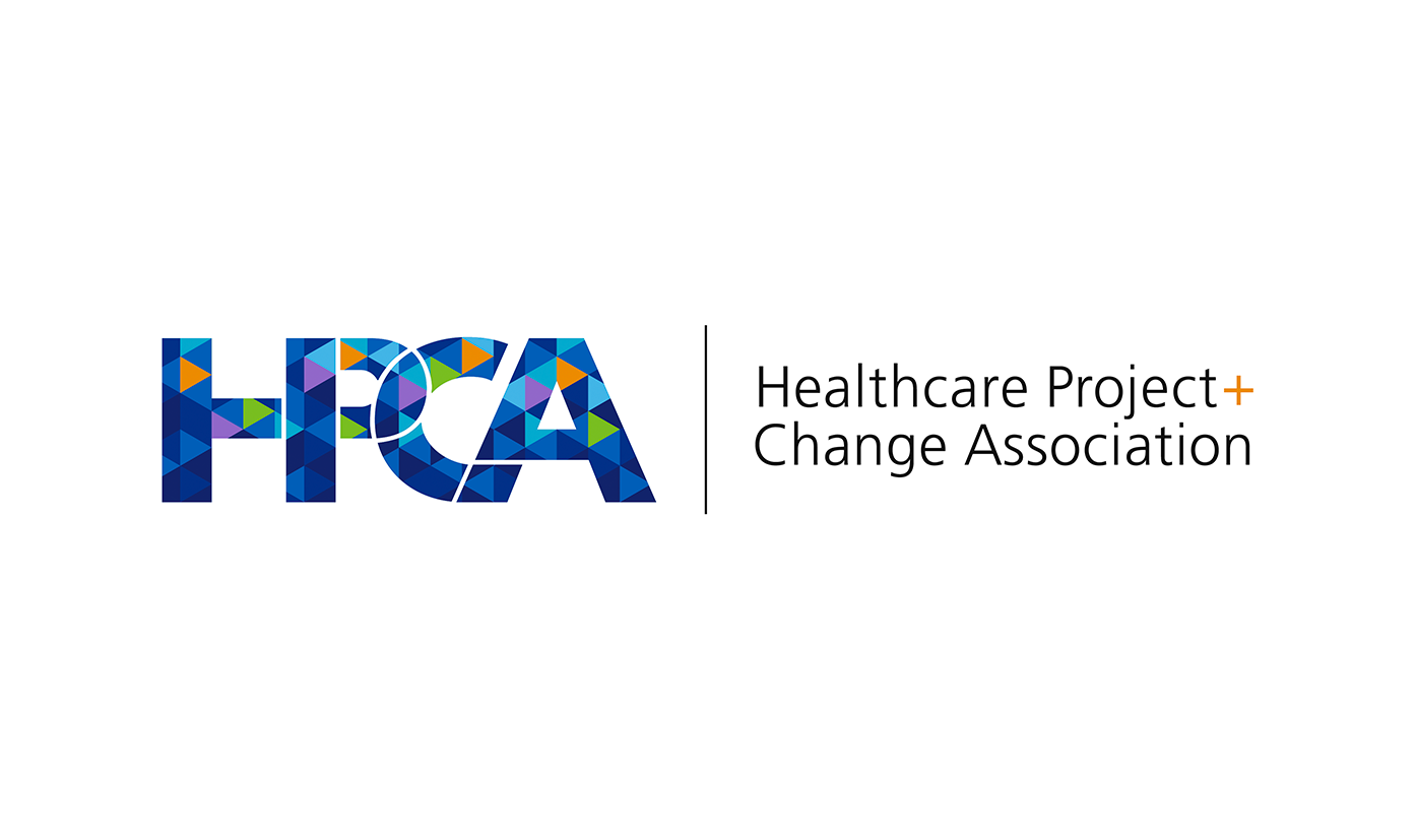
The next stage – a flexible asset
Inspired by several of the initial designs, the preferred HPCA logotype evolved through logical, progressive stages to feature the following:
Please note, employing the five corporate blues and the three accent colours, the HPCA Texture promotes ownership, creates drama and offer a dynamic backdrop for information.
The triangular tessellation offers an infinitely flexible grid where the colours can be manipulated to support all HPCA’s diverse messaging.
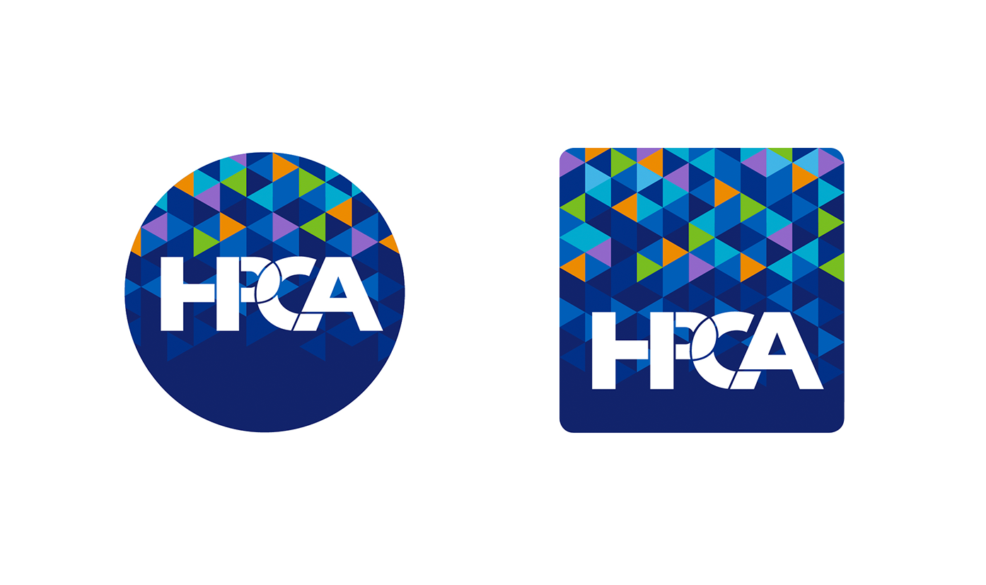
SQUARE / CIRCLE ADAPTATION
Illustrating colour deployment in relation to the social media icons.
Although this case study is a brief synthesis of the extensive work undertaken by the whole SEA team we hope it covers the main points you would be interested in. We would like to emphasis the journey rather than the final brand as in so many cases logos and colours is often a personal choice. We worked very closely with the HPCA team in arriving at this solution. If you would like to discuss and review the process, we would be delighted to have the opportunity of explaining the different stages in the development of the logo/brand journey.

From dealer challenges to communication strategy An initial workshop reframed suppy chain issues into opportunities…

From website to employee engagement A workshop with divisional leaders on website user journeys led…

From operations to growth planning A single leadership workshop alligned directors on priorities and revealed…
Blaze Signs is a recognised as one of the leading European signage groups. They have…
SEA developed an integrated communications campaign to improve local media coverage, boost staff morale and…
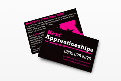
KATO Training, an organisation that represents major training providers in Kent and Medway, came to…
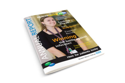
NHS Project Futures was set up to support project and change professionals and practitioners in…
Logo and Brand development The Journey The process often resembles the different stages of a…
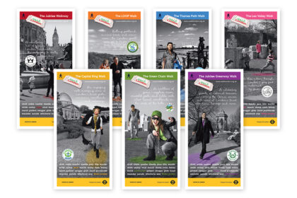
The brief from Walk London was to produce individual leaflets for each of London’s seven,…
When Hornby decided to open a visitor centre, they asked SEA to support with planning…
SEA developed a marketing communications campaign to reposition scrap metal business LKM Recycling as one…
When Meopham became part of the Swale Academies Trust, we were asked to support them…
SEA first met Electra Polymers just ahead of one of their key annual USA exhibitions.…
P&B Metals have been a key client of SEA’s for a number of years and…
SEA specialises in communications for schools and struck up a dialogue with Drumbeat special school…
Like many other law firms, Gaby Hardwicke were experiencing the effect of changes to Legal…